The team relied on surveys. Interviews showed users arrive by phone, through WhatsApp. I designed the personal profile, where each user sets what they share and sees their impact, and a desktop version for posting.
The brief was to expand the platform, but the team couldn't trust its own usage data. Users moved between the platform and social media, so heatmaps and surveys only showed half of each session.
7 interviews
The lead designer felt the two surveys were enough. I pushed for interviews and ran them with the team's UX designer.
Key decisions
01From the interviews
A personal profile for every user
Found
Users wanted content that fit them and wanted to see their own impact. Everyone was anonymous, so the platform couldn't do either.
Chose
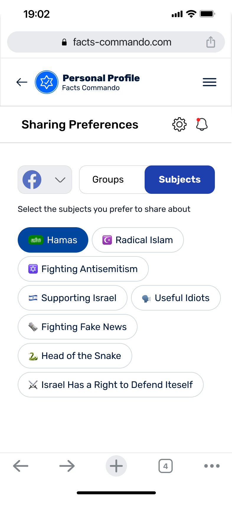
Sign-up, sharing preferences and a profile with impact, reporting and settings. It added a step before the first post, and we accepted that.
1Sign-up
2Preferences
3Profile
02For the data problem
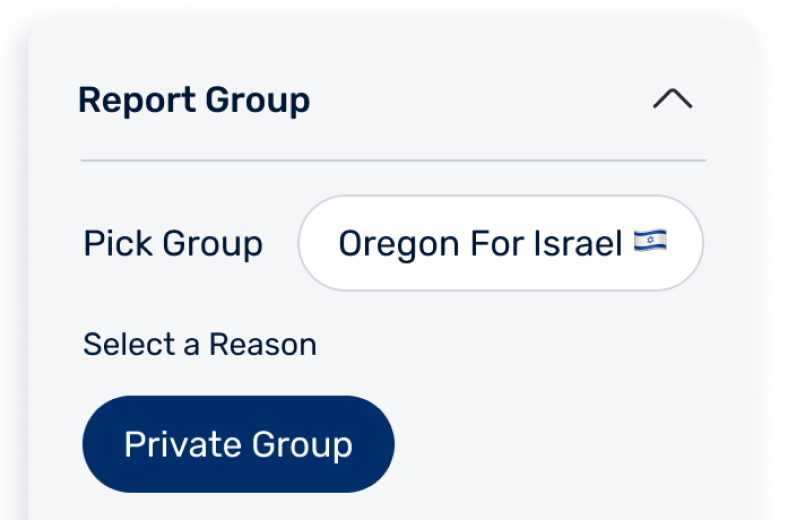
Reporting from inside the profile
Found
The team couldn't trust its own usage data.
Chose
Users can report a group or a technical issue from their profile, so the team hears about problems directly.
03From the usage data
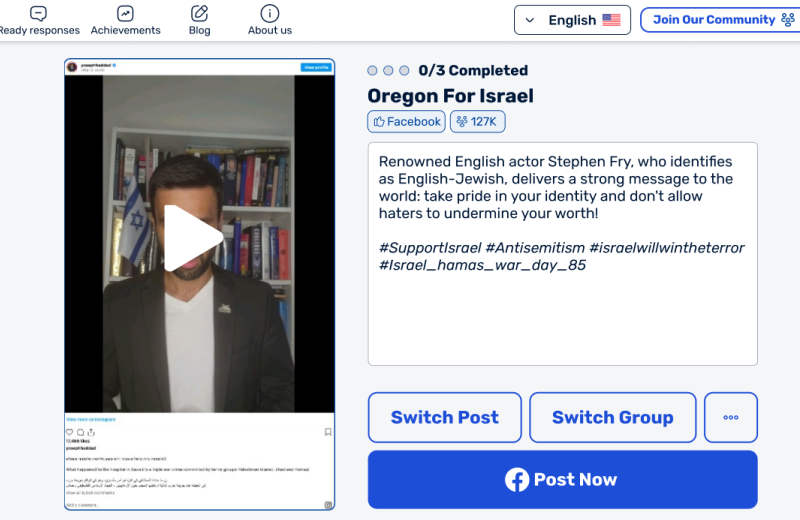
A desktop version built for posting
Found
There was no desktop version, and posting was what users did most.
Chose
I designed the posting flow for 7 screen sizes across tablet and desktop.