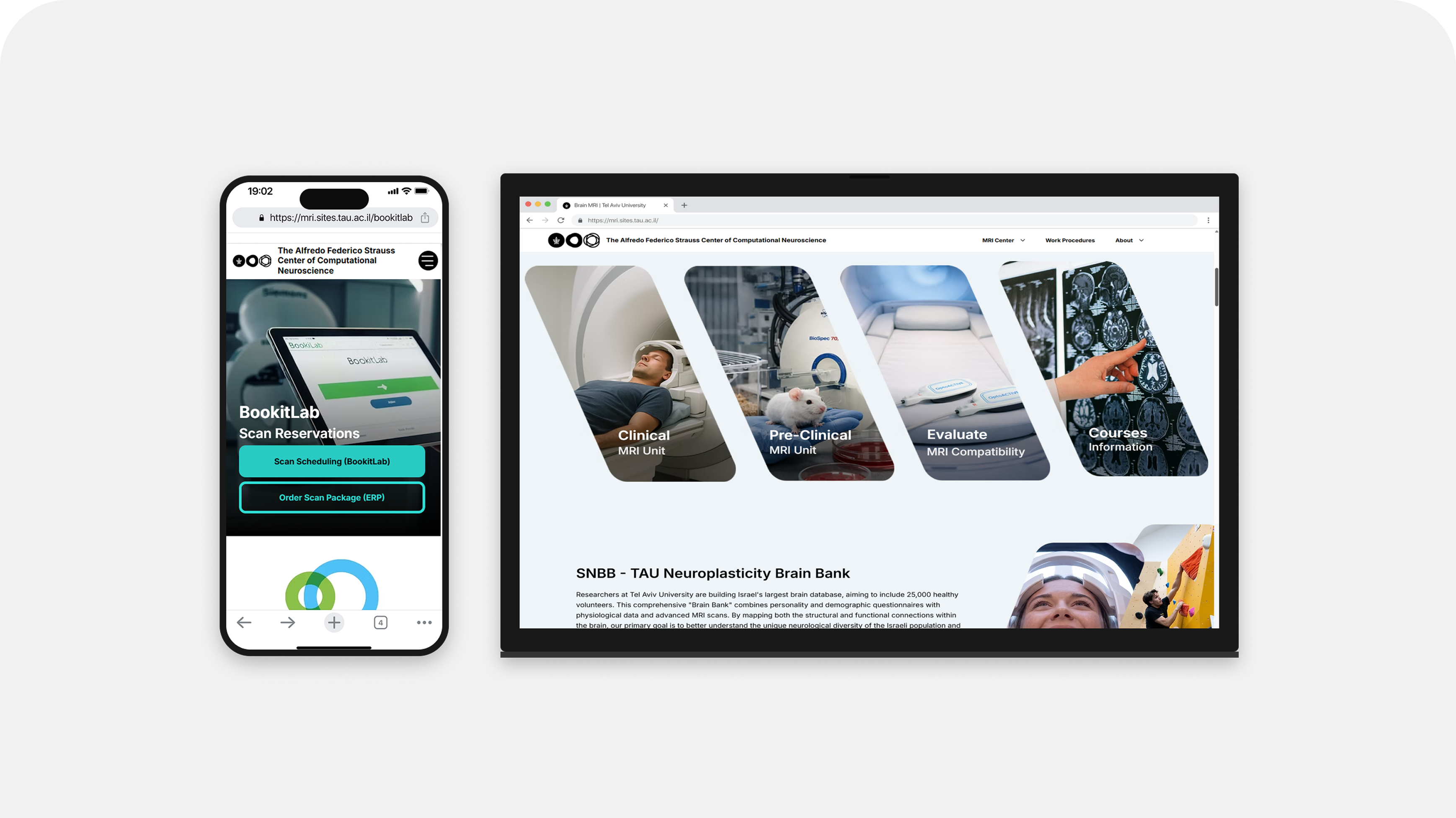
MRI Center
A 2013 university relic nobody stayed on for more than a second - reimagined solo, from research to shipped code, for Tel Aviv University's brain imaging institute.
Outcome
Before the new site, the director got phone calls and emails every day asking how to buy scan time and how to book it in Book-It-Lab: at least 12 regular researchers from the institute, plus many people from outside it. After the onboarding launched in 2026, the regular researchers stopped asking. For a while some outside researchers still called, because they didn't know the onboarding existed. Now they don't call either, according to the director.
Activity 196 visits to the booking guide pages (Book-It-Lab 103, scan purchase 93) · solo research, design, code and media
Problem
The site was a 2013 university template that visitors left within a second. Inside it was a real operational problem: buying and booking scan time was explained only by the director, one person at a time, and he was frustrated by the bureaucracy.
My role
Product Designer, solo, end to end, 2026. I started the project myself and did the research, information architecture, design system, build (Wix Studio with custom code) and media.
Key decisions
-
A guided walkthrough instead of another explanation page.
Researchers needed to complete the purchase and booking, not read about it. I designed a 7-step onboarding they click through, and routed everyone who used to call or email the director to it.
Read more in the full process → -
Media built from real sources instead of photos of the room.
A camera can't go into the scan room safely, because metal is pulled into the magnet. I built imagery and video from real footage, scans and manufacturer photography, edited with AI tools, and disclosed how each was made.
Read more in the full process → -
English by default, without Hebrew.
The people who use the site, researchers, biotech companies and international partners, work in English. Hebrew was an institutional habit, not a user need, so I left it out.
Read more in the full process →
What I got wrong
I designed the animations and buttons in Figma as if they would carry over to Wix as they were. They didn't. I had to rebuild the buttons on the platform and write animation code so they would work properly. I learned to check what the platform can actually do before I finalize interactions in the design.
What I'd do differently
I'd build one test section in Wix early, with the key buttons and animations, before designing the rest of the interactions in Figma.